Fighting Game Design with Dan Fornace: The Power of Silhouettes
Introduction
Hello! For those of you who don’t know me, I am Dan Fornace, a videogame designer. For the last 5 years, I have been working on the indie fighting game Rivals of Aether. We never planned on working on this one game for so long, but I have learned a lot during its development.
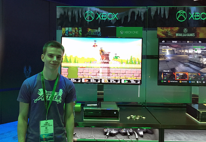
Before we get started, let me explain what Rivals of Aether is.
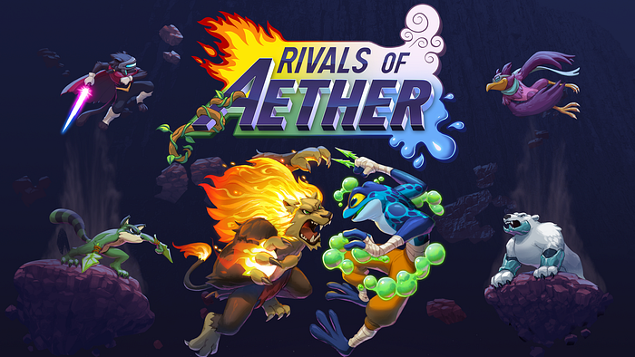
Rivals of Aether is an indie platform fighter. The “Platform Fighter” is a sub-genre of fighting games that features platforming elements and a bigger emphasis on movement than traditional fighters like Street Fighter and Mortal Kombat. The genre currently lives in the shadow of the game that pioneered it — Super Smash Brothers. There are arguments about whether the sub-genre even exists and what games fall into it. But that’s not the point of this article so we’ll leave it at a platform fighter.
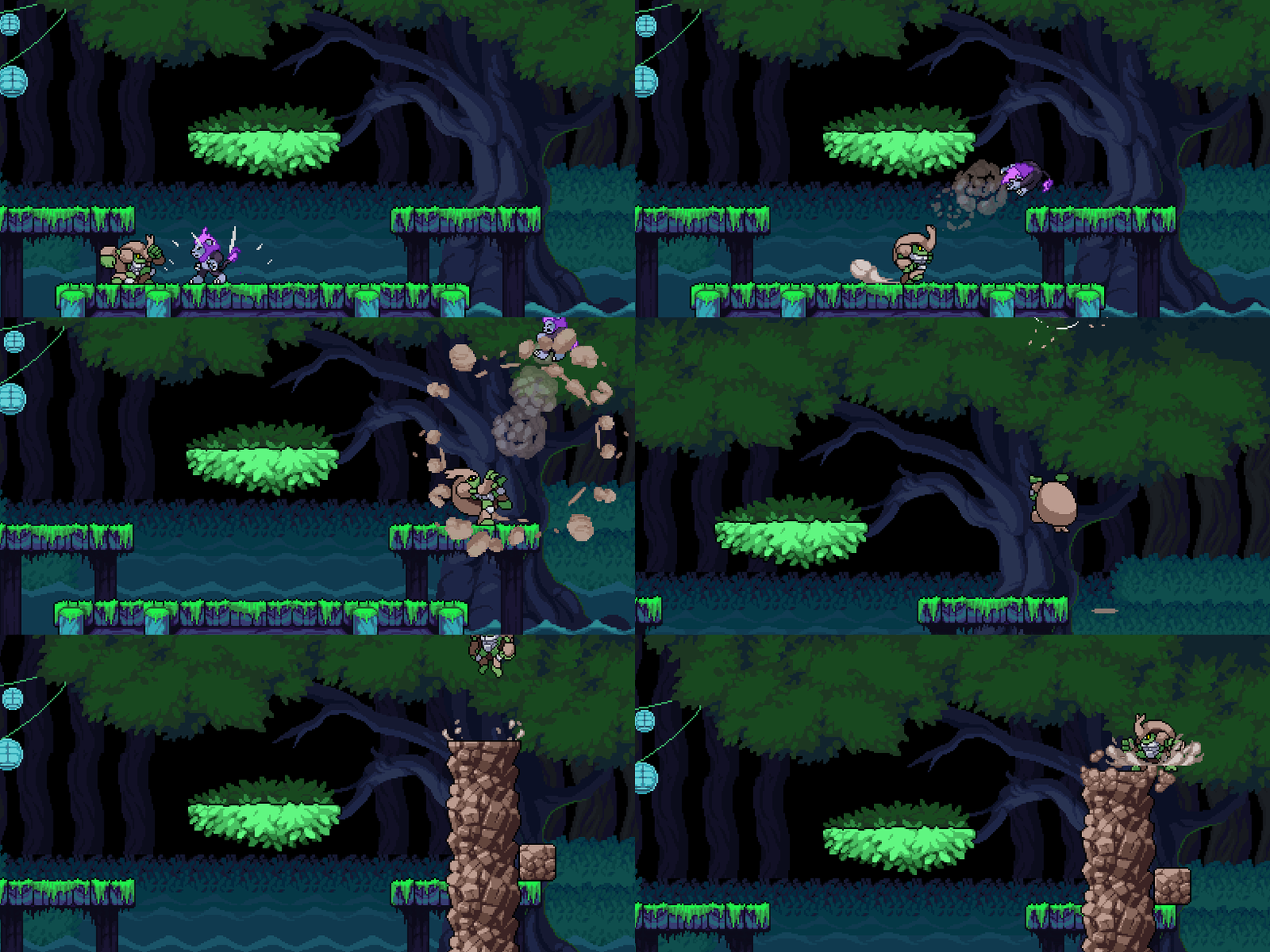
We released Rivals of Aether onto Steam Early Access in 2015 and have been updating it ever since. In 2017, we fully launched the game on Steam and Xbox One. We added 6 more characters during 2017 and 2018. Earlier in 2019, we launched a beta for Steam Workshop support so players can create their own characters through modding. We are now working our tails off on a Definitive release of Rivals of Aether in 2020 for Steam and Switch.
The game is not perfect nor do we manage to always practice what I’m about to preach. But it can stand as a starting point and help explain how we were able to stand out from the pack.
In this article, I’m going to focus on one element of game design: the power of the silhouette. It’s a major part of all video games, but it’s especially critical to games with combat. It’s a concept that is often ignored but with more indie fighters popping up, it’s a concept that is worth discussing.
The Teacher and the Student
Before we dive into design, let’s kick it off with a story. We have to go back in time for this one. Back before development on Rivals of Aether had begun.
We’re back in 2013 in an office in Redmond, WA. A young and easily excitable game designer named Dan Fornace had caught his big break. While working on Xbox Live Arcade games for Xbox 360, he was assigned to work on Killer Instinct (2013), which was gearing up as a AAA fighting game that would release with the launch of the next Xbox game console.

Young Dan was itching for his chance to work on such a title. He had been obsessed with Super Smash Bros for pretty much his whole life and even used his obsession to create a fan-game which gave him a portfolio boost that helped land him the job at Microsoft. Now it was time to see how real fighting games were made.
But alas, Dan was only in his second year at Microsoft and many of his responsibilities lied away from combat. He worked on progression. He designed and programmed chunks of the tutorial. He went to events and made promotional material. But one of his tasks was getting builds from the developer Double Helix and writing up feedback.

And it was this feedback task that helped Dan learn about fighting games in a very short period of time. How did he learn so quickly? Well, fighting games need to be tested with other people. And the people he would play with were other game designers who were also working on Killer Instinct for Microsoft. It was Dan’s job to collect it all. He played with Campbell Tran, Adam Isgreen, and Ken Lobb who are all brilliant designers that each brought their own expertise to the table.
But there was another designer who was brought onto the title a little bit latter. His name is James Goddard and he is something of a fighting game luminary having worked at Capcom on Street Fighter II Hyper and having created his own fighting game Weaponlord. After moving onto Killer Instinct, he quickly became the Design Director on Microsoft’s side of development.
Initially when James started, Dan was also collecting James’ feedback and writing it up for the development team at Double Helix. In order to collate all the feedback from each designer and present it in a meaningful way, he had to actually understand it. And that’s when the brain dump happened.
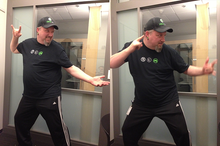
Pretty much everything I know about fighting games comes from James and the rest of the team at Microsoft. And while collecting all that feedback, one word kept coming up over and over. And that word was silhouette. What does a character’s shape look like at any given moment? Why is it so important?
Now that it’s 6 years later, hopefully I can recall what James taught me without butchering it too much.
Character Design
Before we even get into animation and combat, the emphasis on the silhouette begins in the concept phase of development.
A silhouette is when you take a character and remove everything except it’s outline against a flat background. You can think of it like a shadow puppet. In fighting games, the action is moving so fast that you want to be able to understand a character even when all the color and details are removed.
One thing that I learned from James that I tried to take to heart is that fighting games should tell as much story as they can in their gameplay. A Story Mode is not a replacement for visual story telling and it’s up to the designers and the artists to explain as much about a character as possible through their visuals.
One of the most important details to share through visuals is a character’s gameplay style. When building a roster for a fighting game, you’ll want to design characters that appeal to different people both aesthetically and functionally. It’s an incredible feeling as a player to find that one character that really gels with you.
There are two important times to focus on the silhouette of your character. During early concepts and during idle pose concepts.
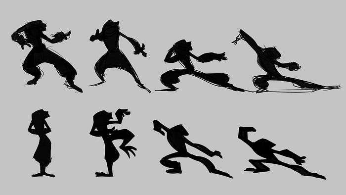
The early concepts determine the physique of your character. Are they thin? Are they strong? Are they human or are they made of another material? How do they move? Do they have legs? Are they fast? Are they slow? Do they stand out compared to the rest of your roster? Do they stand out compared to other fighting games?
The latter idle pose concepts determine the personality and style of your character. Are they arrogant? Are they scared? Are they reckless or are they prepared? Do they lumber or do they prance? Does their stance match the personality that you want this character to have?
With a strong idle pose, you can use that as a guide for the rest of movement of the character. The personality that you have determined should influence everything that the character is going to do.

When starting Rivals of Aether, I was definitely thinking about this idea of silhouettes during the concept phase. So much so, that I used it to influence the world and other aesthetics of Rivals. My first world notes were that I wanted to combine Avatar the Last Airbender with Starfox. And the reason to look at Starfox was to lean on animals to give me unique silhouettes. Each design would expand on ideas that people already have about animals — birds are light, weasels are fast, bears are big and tough. We also worked on idle sprites that would show off personality when we could. Absa stands tall and aloof to act like the fight is beneath her. Maypul stands hunched and prepared to show that she can react and move at a moment’s notice. Even Forsburn, who is hard to see in his silhouette because of his cape, is intentional as the character’s gameplay is focused on deception.
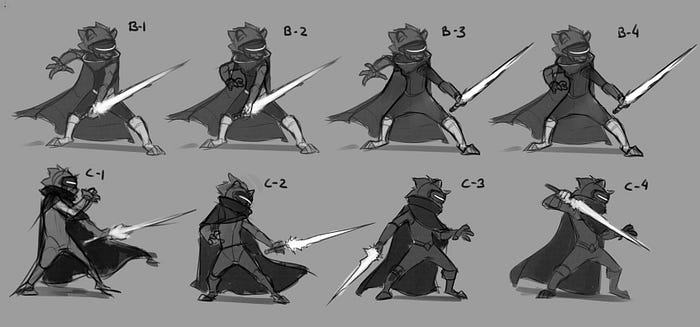
You don’t have to be able to predict a character’s moveset just from the silhouette of their idle pose. But you should be able to get a high level idea what the character is going to be about. This allows people to gravitate toward the character designs that match their own personal style.
Animation Principles
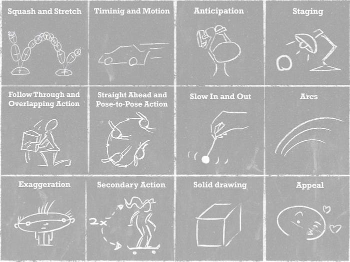
If you are working on animation in fighting games, you need to have a solid grasp on The Illusion of Life and Disney’s twelve principles of animation. Possibly more so than any other genre, a fighting game will live or die by its animation.
Once you have an animator who has a strong grasp on animation principles, they need to crank everything up a notch. The principle of Exaggeration spills over into the other principles. Exaggeration is the name of the game. Fighting games are fast; you don’t have time for subtleties and nuances. Everything has to be shown clearly and quickly. When animating, you should be checking the silhouette every now and then. Make sure your pose can read without colors and details.
While all 12 animation principles are important, some stand out as critical to fighting games and I’ll go over a couple now.
Squash and Stretch

Squash and Stretch is when you deform a character or object to give a sense of weight or motion. In fighting games, you’ll want to combine this principle with both timing and anticipation. Squash before motion. Stretch during the motion. Squash during collision or braking frames. This works both for entire bodies or only parts of the body that are moving.
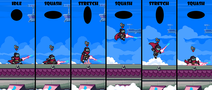
Squash and Stretch is one area that I have noticed that some other recent platform fighters have failed to recognize and it causes their movement to feel stiff and weightless. Your big lumbering character is not going to feel massive if they just leave the ground with no motion in their jump squat.
If you are working in 3D, don’t be afraid to break your characters. Your rigs don’t hold up? Oh well. Break them now and go back and fix them later if it still bugs you. You’re better off having a game that moves well and has broken still frames than being too conservative and getting a game that feels stiff. This rule holds true for so many parts of fighting game development: GO CRAZY AT FIRST. It’s so much easier to tone something down than it is to build it up after the asset has been made.
Anticipation
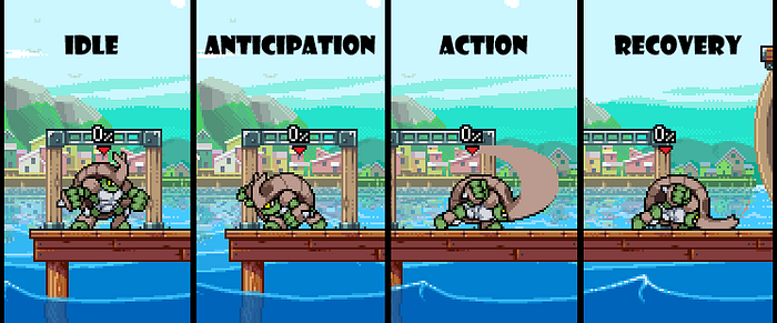
When working on a fighting game, you should always be thinking about the principle of Anticipation. Anticipation prepares the audience for an action and in fighting games, the audience are both your players and spectators. You want to have distinct anticipation or “startup” poses for every action and attack that your character can perform. The more varied you can make these poses the better. Also the longer the startup is, the more dynamic the pose should be. A powerful attack deserves a powerful windup. Your punch is not going to feel powerful if your character doesn’t put their whole body into it.

The startup poses that you design should have a sense of direction or motion. Perhaps a squash or a twist or both. It helps players follow the upcoming action if the anticipation allows them to predict it.
When making a fighting game, an attack’s timing is often tweaked for balance reasons. But be wary changing an attack too much before you need to go back to the drawing board. If an attack that was meant to be a quick jab later becomes a powerful KO attack, then the animation likely can’t handle being stretched to match the new balance. You might have to design and animate a new heavier punch that is inspired by the old attack that has better anticipation and recovery poses.
Timing
One aspect of traditional animation that has its own rules in fighting games is Timing. Timing is the number of frames given to a particular action. Generally the rule is less frames for quick actions and more frames for slow actions.
But in fighting games, you might need to break the rules of both timing and physics when you have to. You need to have your animations show the player when they are able to act and when they are stuck in a previous action. How long after a diving kick is it before the player can start moving again? That is what you use timing to communicate.
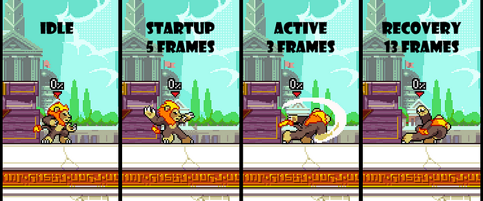
In Rivals of Aether, we’re able to cheat around this rule by having a low variable frame count. Our most basic attacks such as Zetterburn’s jab only really need three frames to function. The animation does not play at 60 fps and each frame is on screen for a variable amount of time. For something like Zetterburn’s jab, the first frame startup frame would be stretched over 5 frames. The active frame would be stretched over 3 frames and the recovery frame would be stretched over 13 frames. This means that the character pops into the startup pose right when the attack button is pressed. Then stays in that pose until the active is hit then again in that pose until the recovery is reached. 13 Frames is a long time so Zetterburn’s jab recovery now has a few frames of animation. But we keep him ducked in that same pose and he pops back into the idle pose quickly. That change to idle alerts the player that they can now act again.
3D games do not have the same privilege that we did where reducing the workload also made our timing better. Instead, developers must make a point to use their animations to communication actions. In general, the rule I have found is that you want to quickly move in and out of idle poses to communicate to players that an action is taking place.
On startup and anticipation, do not waste time! If your character is going to be raising their arm up before swinging it down, get that arm up quickly. The pose with the arm up is the key pose and you want it hit it as quickly as you can — within 1 or 2 frames ideally. The faster they get into a pose that is noticeably different from their idle, the more responsive the game will feel. Next during the anticipation hold, have the character begin to slowly shift their weight starting with the part of the body that will guide the motion. Then after the hold, they explode into the action. SWOOSH! The arm swing comes down and leads the character into a recovery pose.
Now that your attack action is over, you might be thinking- great now let’s slowly get this character back into idle and finish off this awesome arm swing. BZZTT. Wrong. You don’t want your character to just leisurely return their body to idle.
For starters, this looks bad. Nobody that is fighting would just slowly move all parts of their body back to their standing position. It’s unnatural to just return to idle in the method that interpolated motion would give you.
Secondly, this is bad for players. If you just set a linear scale between the recovery pose and idle, then it is impossible for the player to know when they can act. Especially if you are easing them into the idle. Players will feel like they are stuck standing still and the game will feel clunky and unresponsive.

What you want to do is keep the player in the recovery pose for as long as possible. During this time you can have secondary parts of the character react to their action following another rule of animation called Follow Through or Overlapping Action. If they are hunched down after a big swing, then have a cape or hair follow them. The cape can hit them and flutter around as they stay hunched over showing off how much force was behind their swing. Then after some time, have them pop back up quickly and return to idle. This action of getting back up should follow the same rules of animation. A little squash before they push off the ground and then stretch as their upper body moves back up. You can even have them perform an overshoot or other flourishes to add personality to their recovery animations. If your attack requires a long recovery, explore planing out an elaborate animation. The character can spin, roll over or reassemble themselves. But you’ll want to make a point that they don’t get too close to their idle pose until they are ready to act again.
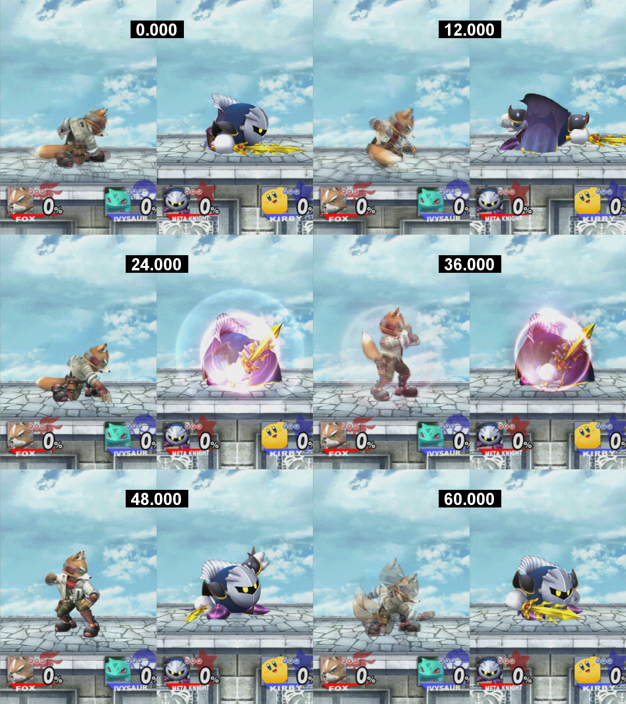
If you are worried about this style of animation looking too poppy and unrealistic for your fighting game, you CAN use more subtle animations to return to idle by incorporating interruptible frames (also known as IASA frames in the Smash Bros series). Interruptible frames allow players to interrupt an animation with any other action as if they were idle. This is a great tool for fighting game developers. During any recovery animation, once you get to a pose that is close to idle, you can enable interruptible frames then animate the rest of the return to idle as slowly as you want. This allows players to press a button when it appears like they are actionable and allows developers to create transitions into idle that add personality, style or just overall smoothness. These are particularly useful in a platform fighters when it comes to airborne actions as you can animate stylish tumbles after attacks that are unique but don’t prevent players from performing more actions.
Silhouette and Animation

It might seem like the topic has derailed away from silhouettes when discussing the principles of animation and in some ways it has. But with the poses that you are hitting, you should always be considering the silhouette. Each key pose should read even when removing all the details. Again, this is where exaggeration comes into play. The poses will be moving fast on a variety of backgrounds, so you need to be as clear and direct as possible.

When coming up with initial poses, you can use photos as a starting point for how you could position your characters. Unless you are going for a traditional Mortal Kombat rotoscoped style, you’ll want to exaggerate the poses much further past the reference. But photos can be a great starting point when you can’t decide what your key poses should look like. It also helps you get out of the chair and think about your attacks in new ways which does wonders for the creative process.
When working on 3D animation, remember that a fighting game is viewed from the side and that it’s more important to have your motions read well from the game’s camera rather than looking realistic from all directions.
Colors and Clarity
I also want to discuss an element that is separate from silhouettes but has the same goal in mind. And that is using colors and values to increase clarity in your fighting games.

The first way you can use color to increase clarity is when designing your characters. When designing for a fighting game, simplicity is key if you can afford it. Fighting game characters, particularly in platform fighters, are moving very quickly and it’s hard for the eye to track little details. You want details to be large and in your face. You want to think about big color areas that draw the eye and also help separate the body. If your character is primarily a weapon user, then don’t hide the weapon. You want it to be front and center.

One trick that I learned from James is using color changes to help track limbs. We use this trick in Rivals of Aether to help improve readability. Zetterburn attacks with his hands so we have a color change from his arms to his hands so they are easy to spot. Forsburn uses a dagger so his hand is not as important as the dagger popping out. Maypul’s brightest color is on her leaf blades that she uses to attack and she also has ropes wrapped around her forearms to separate her blades from her body. And Etalus is a simple character who attacks with his bite and his arms and his ice helps you track his assaults.

Another way that you can use color and value to aid your game’s clarity is the ranges that you assign to backgrounds and characters. A general rule of thumb is that you should create a hierarchy on how much saturation and contrast each element should have. The order would look like this:
- Characters: Highest Contrast
- Projectiles and Character Articles (ex. Kragg Rock)
- Stage Elements with Collision (grounds, walls, platforms)
- Close Background Elements
- Far Background Elements: Lowest Contrast
The further you get away from the camera, the less contrast elements should have. Look at the above screenshot how Smash Bros Ultimate does a better job with both values and colors when it comes to making their characters stand out from the background. I would argue that the visibility of characters has gone down in the series since Super Smash Bros Melee, but they are still the best platform fighter when it comes to clarity even in their newer titles.

Once again in Rivals of Aether, we were able to cheat when it comes to visibility. Being a 2d pixel art game already gave us a leg up when it came to determining lighting and colors. But we took it a step further and pushed the visibility as much as we could. All characters have a black outline around their sprites to help them pop from the background. We also have black outlines around collidable elements such as solid ground or jump-through platforms. We use the background contrast hierarchy that I posted above and don’t use solid black on any elements that aren’t part of the gameplay.
Conclusion
There are numerous more elements that go into fighting games and making them feel good to play. You’ll want to have a solid grasp on game feel and interactive design to be able to troubleshoot if your game is feeling stiff. Fighting games aren’t the best genre for fledgling developers because they rely on so many pieces of game development to be strong for the game to be enjoyable. I would recommend that people dip their toes into a few other genres before embarking on a fighting game.
But I hope that I was able to shed some light on one aspect of developing fighting games that often goes overlooked. Follow me on Twitter and let me know if you would like to see me tackle any other topics related to game design. Until next time!